Opposing viewpoints: Are the Atlanta Hawks’ new uniforms ugly?
August 26, 2015
U-G-L-Y: Hawks ain’t got no alibi
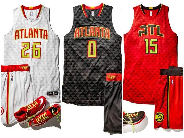
Forget snow, flooding, tornadoes, and criminals, Atlanta just created a new public enemy number one: the Hawks’ new uniforms. Atlanta’s temporary favorite (until they go back to failing, mediocrity, and losing the support of an entire state) sports franchise recently received new uniforms and the new look certainly captures the essence of modern Hawks basketball: “We may not be the best or most talented but we do try really, really hard.”
From heavy neon color use to the flaming basketball logo on the shorts, the unique design screams “flash in the pan.” Frankly, it just leaves me wondering why. The Hawks took their “Pac-Man” logo and promoted it to their primary brand symbol, something everyone across the country will see and associate with the Hawks. Instead, they gave it a sickly, pale look one can associate with images of radiation poisoning.
The red uniforms stand as an alternate, as evidenced by the money saved through cutting out the “anta” part of Atlanta and changing the first “A” to a camel kneeling with his head spun 180 degrees backwards looking at his tail (and yes, he does have a tail). The white uniforms prove tolerable, but the neon remains a step too far in the direction of attention-grabbing. If the team replaced the neon with a normal yellow or even a green, it would certainly be a step in the right direction. The black uniform, primarily for road use, looks like a piece of charred wood. Still, the uniforms received adequate reviews. David Roubles, a North Cobb junior, said “they’re all right,” a perfectly common answer from most students I asked.
From a marketing perspective, however, the uniforms do appeal to a younger generation, possibly in an effort to build a loyal local fan base in coming years. However, the bread winners of 2015 are interested in seeing a winner long before flashy and way over the top fashion flares. Although the old uniforms exhibited simplicity, they will not drop ratings because viewers turned off their televisions just to escape. And can someone please explain the purpose of the triangles?
The Bold and the Beautiful
The Atlanta Hawks made a bold and interesting decision this offseason, coming off their best record ever: choosing to entirely change their uniforms. Despite having an amazing season, reaching the conference championship does not satisfy them enough. Something needed to change, and what else other than to make some sweet new uniforms?
In the introduction of the new uniforms at Philips Arena, the Hawks explained the uniqueness of each color. On June 24th, Philips Arena held a live introduction to the Hawks new brand, uniforms, and logo, with an interactive presentation on the court. Whoever failed to get pumped from this video must hate the hawks. In the video, it explains the new logo and colors. The new logo introduces a phoenix, which played as the start of the new look campaign. The secondary logo represents the diversity of Atlanta’s music and culture. The patterned triangle gray, which people do not seem to understand, represents the essence and toughness of a true hawk. Torch Red, Georgia Granite Gray, and Volt Green, the new colors, all connect to the heritage of the Hawks. Torch Red and Volt Green bring together all the past Hawks, with a fiery and fierce look in both. Lastly, Georgia granite gray stands as the boulder for the team, looking tough and sharp, scaring off opponents.
The most unique part about these uniforms remains that any of the jerseys, home, away or alternate, will go with any of the shorts. This new look brings Atlanta a new, modern style, as well as bringing back the old times and remembering the greats.
I personally love the new look. Introducing a modern, hip style to a developing team can bring fans in from everywhere. The main reason behind the new look remains wanting a look that distinctively separates them from the rest of the NBA. Mission accomplished.


