Color saturation and brightness in live-action films prove essential to the audience’s interpretation of the story, but a recent emergence of movies showed an increase in muted colors and grayer tones. This development provides variety to the ways of movie creation and brings an increasingly diverse selection to modern films. This topic remains important to NC youth because the majority of students enjoy watching movies and numerous students take film classes or plan on going into film-related career fields.
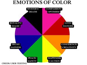
Without the presence of color in film, filmmakers may struggle to portray feelings, impact the audience’s emotions and demonstrate important shifts within the story. However, using muted tones can also prove beneficial in several ways, as the shades can help filmmakers tell a specific story. Black and white films from the 1920s to the 1950s prove a perfect example of how not using color can help progress a storyline, as they depend on the vibrancy of characters, plot and dialogue, rather than visuals. These films can utilize the darkness to create a specific vision, which filmmakers continued to create even after color technology in film became available. Color saturation serves as an important aspect in film because of how people use it to emotionally impact the audience and affect the perception of the work. Additionally, colors can represent certain aspects in film such as emotion, character growth and change.
“This filmmaker, Barry Jenkins, made a film called Moonlight which won Best Picture about seven years ago. His very first movie was a really tiny independent film that he made in San Francisco. It was called Medicine for Melancholy, and the story was about two young black people, a man and a woman. It’s a beautiful movie, the whole city looks beautiful, but what was really cool about it was the color scheme was almost black and white, not quite as you could see browns and you could see reds, but everything else was either black or white. The reason Barry said that he did that was because he did some research on how many black folks lived in San Francisco at the time he was making the film and at the time San Francisco was only six percent black, so he decided he was gonna make his film where he would only show six percent color. It’s a subliminal thing, but it’s actually part of the story he’s telling,” director and film professor in the University of Georgia film and theater program Marty Lang said.
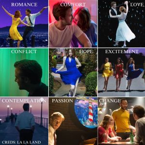
The hit motion picture “La La Land,” a 2016 musical romantic dramedy, utilizes intense saturation and colorful lighting. This choice exists not only for aesthetic purposes but to convey the story visually through color changes and associating different hues with different themes or emotions. For example, the filmmakers show emotional and relational change by clothing the main character, Mia, in different colored dresses throughout the story to portray her growing connection to her love interest, Sebastian. Additionally, the film utilizes creative lighting such as neon signs and multicolored light fixtures throughout the story to depict emotion and change. Numerous scenes in the film use colored lighting to make certain scenes appear dreamlike and surreal.
Filmmakers frequently use dark shades to portray distinct emotions or situations. According to Emily St. James, a reporter for Vox, a myriad of potential reasons exist for filmmakers wanting to use darker tones instead of lighter ones. Reasons for wanting to use darker colors include the rise of digital color grading, attempts to replicate the style of “The Matrix” and creators‘ eagerness to showcase technical skills.
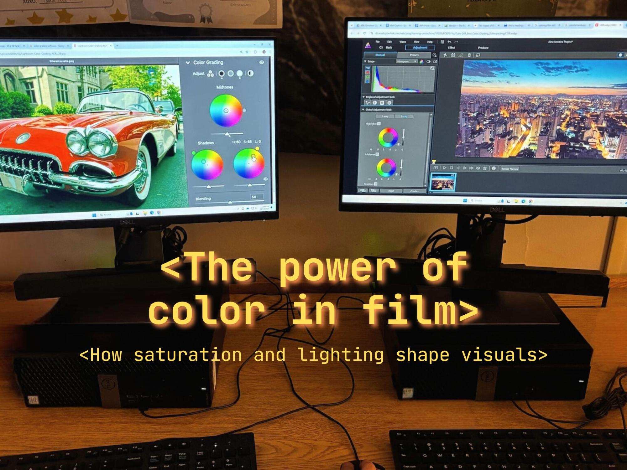
Digital color grading consists of the process of enhancing the color and mood of a digital image or video. As of 2017, filmmakers shot 92 percent of all live-action films digitally as opposed to celluloid film, meaning that the majority of films use digital color grading. Filmmakers use this tool to bring their visions to life and create a unique color scheme to appropriately tell their story. The hit movie “Twilight” proves a perfect example of this phenomenon, as filmmakers color-graded the entire first movie to appear with a blue tint. The creators maintained unique reasons for following this artistic vision, including portraying teenage angst and emotion, dramatizing the setting and its dreariness and demonstrating the overlap between vampires and humans. Although the later installments of the franchise did not include such color grading, the color palette of the first movie remains iconic to viewers and the film world.
“I think darker and more murky colors help add a mysterious factor to a film and create a darker tone to the film. I think bright colors can be more engaging if you are feeling happy and dark colors are if you want to watch a mysterious and maybe scary movie. I think darker colors add deeper emotions and can create a complexity to the story that makes the audience think,” magnet junior Seren Witschy said.
Filmmakers also increased their usage of physical film rather than digital in recent years due to its ability to portray images with a life-like quality, as it interprets scenes similarly to the human eye. Physical film pertains to color as it contains the unique quality of bringing colors to appear richer and perceiving light similarly to how a person would. This form of filming footage proves fairly difficult as the physical film requires specific temperatures and conditions in order to not expire.
“Celluloid film, it’s the way the human eye sees as compared to digital. It is an organic material and it’s almost like fresh produce, it expires. If a film house makes a film for filmmakers, that film expires and after two years basically, it starts to lose color and its sensitivity. If we get something and we know we are not going to shoot it in a year, we may put it in the freezer. We know not to leave it in the car especially in the Atlanta heat and humidity because it’s going to take away from the film because the material is so sensitive. We have to understand that it produces a very organic, life-like shot, more so than the digital format can produce,” film director and Georgia State University professor Robbie Land said.
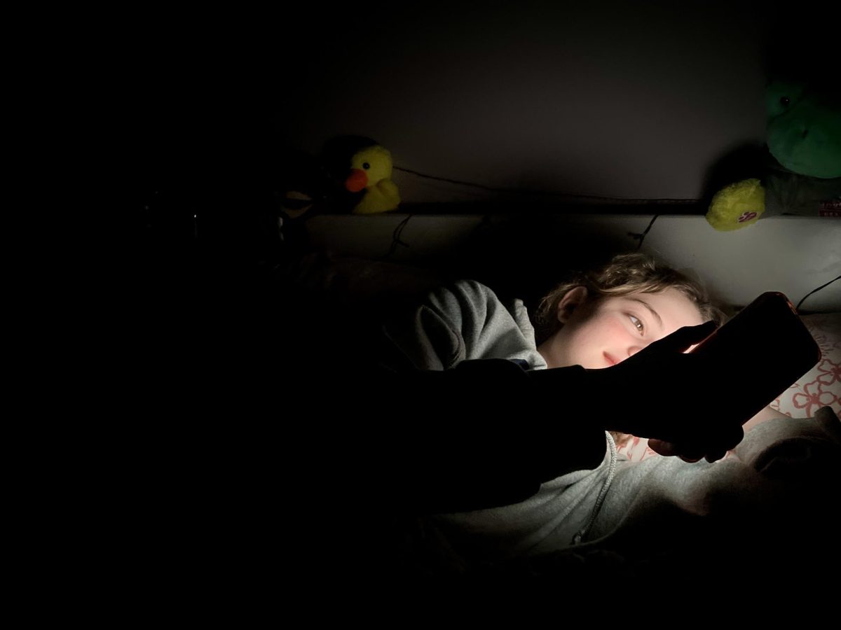
Digital technology allows directors to easily create bright and colorful images with low amounts of effort. To counteract the frequent use of this technology, filmmakers began to intentionally utilize an increasingly difficult approach of color grading to cause colors to appear skillfully dark. This technique can serve as interesting visuals that contrast brighter areas on the screen, which is often known as Chiaroscuro. The term Chiaroscuro originated in the 15th century to describe shadow and light usage in paintings but has since shifted to pertain to this style of film lighting.
The production of “The Matrix” significantly affected the creation of modern films and became an inspiration for filmmakers to attempt to recreate. This film held such significant influence due to its unique and groundbreaking qualities such as how it visually strikes the audience and its highly recognizable artistic style. This led to an influx of movies with a dark, gray, and edgy tone with low color saturation such as “Inception”, “Tenet” and “Arrival.” This trend set a tone for other dark and dramatic action movies, as countless use darker color schemes rather than brighter ones. Because of this shift, modern action movies frequently contain muted colors with low brightness. Marvel films proved an important contributor to this shift to grayer tones in action films, as their movies utilize these colors to create drama and suspense.
Occasionally, filmmakers combine brighter and darker color palates within one film in order to provide contrast, place emphasis on specific moments or represent emotional differences between different scenes. For example, in an upcoming film from Marty Lang, the creators plan on filming half of the movie with an orange tint to represent the past and its brightness and vibrancy, whereas they film scenes set in the present with a blue tint to represent a drearier and sadder time. This creative choice proves important because it highlights the dissonance between the past and present aspects of the film and facilitates the creator’s intended story.
“I actually directed a film that’s going to be coming out next spring and it’s a drama. It’s about mental illness and it’s about a young woman who’s got a mental illness and who’s really struggling with it. The film takes place in two timelines, one is the present day and then the other one is six months before the present day. Whenever we cut from one time to the other, there are different colors. The present day is blue, it has kind of like a blue haze over it and then everything that’s in the past has an orange haze over it. That’s partially because the present timeline is a little bit sadder and the past timeline has a little bit more energy to it because this main character is getting into a relationship for the first time and they have their best friend and there’s a lot of interpersonal things that go on there. That’s a way an audience can keep track of where they are,” Lang said.
Creators of film series occasionally alter their color palettes throughout the progression of the series to achieve a shift in tone or theme. As an example of this, the “Indiana Jones” series contains older installments featuring scenes rich in color and saturation, whereas producers used sepia tones in the newer installments. Additionally, a myriad of movies and TV shows utilize these sepia tones to emphasize dry settings such as deserts to help the audience feel the contrast between different places.
Filmmakers utilize a technique in which they use bright colors and high saturation to tell a story with dark themes or vice versa in order to disconcert the audience. The 2019 horror movie, “Midsommar” proves a fantastic example of this technique as the creators utilize vibrant tones to portray surrealism and force the audience to feel unsettled by bright colors portraying sinister themes within the film. Wes Anderson films notably use this strategy as Anderson opts to employ bright colors to portray dark subject matters in his signature style. Major films of his featuring this technique include “Asteroid City”, “Royal Tenenbaums” and “The Grand Budapest Hotel.”
“I think in some instances intentionally dark or murky colors can really emphasize a situation or an emotion being experienced in a film as darker colors can show hardships experienced by characters. I also think darker colors make horror movies significantly scarier because most people do not like feeling like they cannot see something, as it gives them a sense of unease so emphasizing shadows and darker color gradients in a horror movie makes it even more unsettling and adds an extra layer of fear,” magnet junior Bryce Nichols said.
Ultimately, color brightness and saturation levels hold a strong effect on movies and TV shows as well as the audience’s connection. The hues strongly impact the mood and tone of the media as a whole, along with emphasizing change and development within the story. Using a darker color scheme can help watchers understand the gravity of the scene, whereas brighter color schemes represent change, growth and other powerful emotions. While no color scheme surpasses another, higher or lower levels of color saturation can help filmmakers effectively set the tone of their creation and bring the audience to feel emotionally connected to the piece.
