iOS 14: ‘widget’ or ‘ditch it’
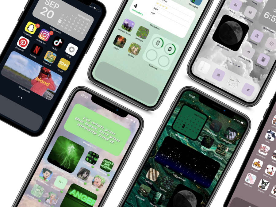
Submitted by NC students, each of the home screens pictured showcase the creativity now available to Apple users. The widget feature of iOS devices, something that no one expected, spiraled into a major obsession. Dozens upon dozens of students submitted their home screens; rendering it impossible to showcase them all. Something so simple such as the ability to customize a home screen to a variety of one’s liking ranks high on the list of ‘unexpected joys of 2020’.
October 11, 2020
2020 made dozens of random concepts into fully fledged obsessions and fads. From an obscure early 2000s cartoon version of JFK becoming a mainstream meme to the hundreds of McDonalds ravaged dry of their quarter pounders from the Travis Scott burger, the craziest of it all comes from an Apple devices update.
Seemingly inconspicuous, no? The update contains a good amount of items that Apple users begged for years since the FaceTime update. Best described as massive, the update included multiple concepts that people asked for, such as smaller phone calls, pinned conversations and emoji search. A detailed list stands on Apple’s page of all the new ideas with the update, but one concept stood out amongst the rest: widgets.
Widgets, while not a new concept from Apple, started off humbly inside Apple watches and on the sides of iPhones’ explore pages, since transformed into the biggest feature of the updates launch. The widgets became completely and utterly customizable, down to the color, size, and display image, along with the rest of people’s apps. This feature combined with a widespread rumor that updating before this past Sunday (September 20th) would allow them to keep TikTok on their phones while the app disappears from the App Store. Needless to say, the combined factors caused a gigantic frenzy of people by the thousands downloading and rearranging their phone layouts. People submitted a good chunk to The Chant, the cover only a fraction of the photos.
Dozens of NC students (and students across the East to West coast) spent hours upon hours of their lives reorganizing their phones across a singular theme, enjoying the features greatly.
“I love it, it’s so organized and I’m obsessed over my home screen,” said NC sophomore Claire Scafidi.
However, the majority of NC students felt indifferent towards the update. Out of 35 people who responded to a poll of how they felt about the update, 18 said that they did not particularly care. These students represent a silent majority, voices drained out by the extremely vocal positive and negative feedback.
“[I] don’t like it,” said sophomore Treasure Walker. “Everyone’s doing the absolute most and it’s annoying. Why is everyone’s phone color coordinated the exact same? I’ve seen a couple that look good, but it’s irritating. Apple did way too much with this one.”


