


iOS 10 hides helpful features behind gaudy updates to Messages
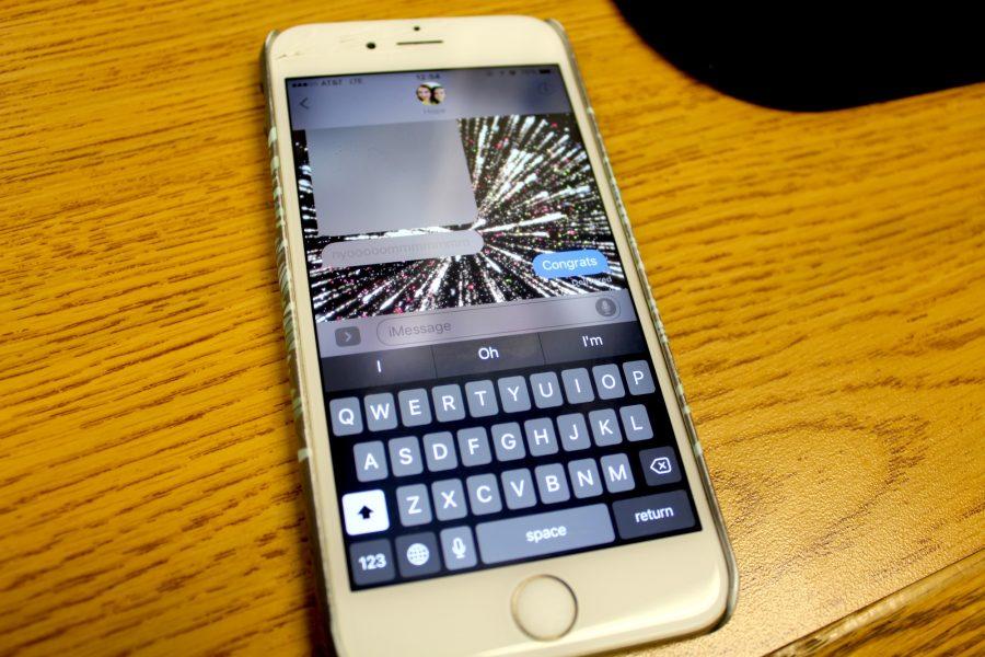
A user sends a message of congratulations with fireworks, utilizing the updates to the Messages app on iOS 10.
August 29, 2016
Set to release to the public in fall, Apple’s newest iPhone operating system, iOS 10, became available for public beta testers in early August. The update includes a wide range of new features, including a major overhaul of Messages, a renovated control center, the ability to delete preinstalled apps, redesigns for Maps, Notes, and Photos, and much more.
iOS 10 starts with a redesigned lockscreen, including larger text and volume slider. Users utilizing Touch ID must now press the home button to unlock the phone from the lockscreen, rather than just holding a finger over the sensor. The new operating system also supports “Raise to Wake,” which wakes the screen any time the user puts the phone into a vertical position.
I ended up turning off “Raise to Wake” in my settings after a couple of days, though, because the constant lighting up agitated me and I do not find it too taxing to press the on button to wake my screen.
Furthermore, by swiping left users can access a refurbished notification screen, featuring the date and time in larger font, “Up Next,” which shows upcoming events in Calendar, Maps Destinations, displaying upcoming destinations based on events, and the ability for new widgets including Transit times and updated Siri application suggestions.
Notification and Control Centers
Notification Center functions smoothly and allows total customization, which means any user’s most important messages stand out while still falling into an organized system.
Notifications themselves now work in a new layer of interactivity, utilizing the 3D touch feature Apple unveiled in the last update. By pressing down with extra force on any notification, the phone will open a separate window showing the full application for quicker viewing and responses.
The ability to answer messages and notifications using the same 3D touch capacity included in each application makes it a lot easier to multitask while using the phone and reach peak productivity.

By swiping up on any screen, users can access Control Center, which received major improvements in iOS 10. Most distinctly, the phone now houses all music controls in their own separate menu which users can access by sliding to the right.
After using iOS 10 for almost two weeks, having music in a different menu makes it a hassle for control. I never minded having all functions in one menu before, and now it becomes the extra mile of having to switch between two. Other than organization, I do not understand the necessity.
Siri keeps all of its previous functionality, and now the virtual helper allows developers into the system, meaning users can ask for Siri to call an Uber or send money with Square. The feature only adds to Siri’s functionality as an assistant to each user.
Inside The Phone
Responding to the demand for storage from the majority of iPhone users since the phone first debuted, Apple introduced the ability to delete most preinstalled apps with iOS 10 as well. Users who find no functionality in a compass or stocks application can now delete them to make room for other data.
After upgrading to a 64 gigabyte phone, I no longer experience the woes of storage, but I do appreciate the ability to put the apps I never use out of sight and out of mind.
In addition to deleting apps, Apple also debuted the new Home application to become a center for technology controlled over the phone; devices include lamps, speakers, thermostats, and more. By setting up each device in one place, handling comes with ease.
As someone who owns only a controllable thermostat, but looks forward to investing in other devices, I would like to use the Home application in the future, but cannot speak much of its utility right now.
Messaging
The biggest update to the phone lies in a swath of new features built into the Messages application. Users can now send messages with background animations that engulf the whole screen, ranging from balloons and confetti to lasers and fireworks. Messages also supports bubble animations, meaning users can send texts that slam onto the page or float gently, or even display in “invisible ink.”
The application also includes Digital Touch, which allows users to draw pictures or write words in a variety of colors, as well as use certain preset images or draw on videos. Furthermore, users can send handwritten notes by turning the phone into landscape mode, where they find a white screen for writing.
Apple also added the capacity for sending media by allowing users to annotate photos with drawings, as well as incorporating a tab just for applications where users can quickly search for images and gifs, download packs of “stickers,” send Apple Musics songs, or use any other functions that developers may include in the future.
Lastly, Messages now includes rich links which show a preview of the website directly in the message, bigger emoji, and a new feature called Tapback that allows users to express their feelings about a certain post by clicking twice on it and choosing a heart, an exclamation point, a like, a dislike, or more.

The updates to Messages feels almost overwhelming. The background animations and bubble effects seem tacky and only work for specific situations. Why would anyone need to send a message with fireworks on a regular basis? The bright side, though, lies in the invisible ink, which makes it easier to distinguish a secret or a special saying in conversation.
Furthermore, I spent the first two weeks of my beta testing without anyone else testing the system, and when I tried to use the animations, they did not work for anyone else. At the end of the two weeks I finally convinced a friend of mine to beta test as well, and I did realize that once someone else could use and appreciate the new effects, I enjoyed them more. Still, I found myself wondering how quickly I would stop caring.
I have used the Digital Touch feature quite a bit since starting my beta testing, mainly because of the ease with which I can draw a quick sketch or write out a short phrase and send it to my friends.
Still, overuse may hurt the eyes due to the black background and neon colors or become annoying as the drawings disappear after two minutes. The handwritten note feature I enjoy a lot more.
The white background and gray font makes it easy to send cute handwritten notes to friends and family, and the messages never disappear. They add an extra personal touch to conversations without becoming overly gaudy.
The new media updates hit the middle of the road for me as well. Annotating photos adds flair when sending to my close friends, but does not feel appropriate in any other setting.
The applications tab confuses me the most, and takes the spot as my least favorite feature. By including the ability to send “stickers,” Apple falls onto the level of Facebook Messenger’s overwhelming cheesiness. While I suppose having an internet browser for images right in the Messages application adds utility, using Bing as the browser brings down its reputation. One upside, though, of the image search lies in the application scanning your recent conversations and suggesting topics for images. I appreciate the function, but do not plan to use it more than once a month.
Tapback also sits at the bottom of my list. I cannot see the reasoning behind the function; if users like a comment, they should just send back a message saying so. In almost three weeks of beta testing, I never seriously used Tapback because I honestly just forgot it existed.
One of my favorite changes, though, comes in the form of rich links. Previewing a link right inside Messages saves time and means the user can receive more information by doing less.
In addition, the change in emoji size and the design of the facial emoji took me by surprise at first, but only improves my use of the application.
Photos
Photos received an update as well, including improved facial recognition software as well as object recognition. Now users can search for any object right in the application, like “dog” or “football”, and find all of the photos including the object.
I love the idea of object recognition, but so far its accuracy comes and goes in waves. For example, when I searched dog, it returned with a picture of my cat. I look forward to the feature, though, and the ease with which it will make searching for my pictures in the future.
In line with popular apps like TimeHop, Photos also includes a new Memories section where it gathers photographs from a certain time or place and creates a slideshow showcasing them.
Looking back on sentimental photos with nice music playing in the background brightens my day, and Photos can now do it with ease. The ability to change the music and the length of the slideshow adds charm. I like that Photos now allows me to take trips down memory lane.

Maps
Apple also amended Maps to include what I wanted for months: nearby suggestions. At any point, Maps can now find nearby restaurants, gas, shopping, travel, and more with the touch of a button.
Apple also added the ability to use Apple Pay on the web, which certainly comes in handy when making quick purchases off of trusted websites. They also deleted the Game Center app, due to lack of usage and to the disappointment of no one.
Lastly, Apple added a new feature under Clocks called Bedtime, which can set a morning alarm, ask the user how much sleep he or she needs per night, and then notify the user of the best time to sleep. It claims to “calculates hours in bed by analyzing motion and device usage.”
The Verdict
Overall, Apple’s new update adds a number of useful features, but gets bogged down in tacky and unnecessary changes to the Messages application that anyone older than thirteen will quickly grow bored of.
The Chant’s Grade: B+


Anabel Prince • Aug 30, 2016 at 11:49 PM
So wonderful and detailed. I would expect nothing less from the lovely Kat Shambaugh 🙂