Skip to Content
Through the refined use of shape, silhouette, and color, character design visually conveys a character's emotion and personality.
Through the refined use of shape, silhouette, and color, character design visually conveys a character’s emotion and personality.
Wyatt Toth

How the design of a character impacts personality and emotion

Categories:

Repeatedly overlooked in character descriptions, visual design plays a key role in conveying a person’s nature. Shape-language, silhouette expression and color palette all play a role in adding depth to a personality.

Round shapes, as seen in cartoons and animations, accentuate friendliness. Perceived as lacking danger, circles appear in comical and lighthearted characters since the lack of sharp edges appears inviting. Additionally, in animation, round shapes appear bouncy, visually showing energy. (Wyatt Toth)
Box-shaped characters normally appear with broader frames and rigid corners, which show power and confidence. Squares and rectangles also frequently appear in real-world examples. For instance, the shape of a picture and a television — usually a box shape — normally frames a composition. Giant silhouettes show emphasis on the space they take up to contrast with petite characters, whether maliciously or as a symbol of strength.
“Shapes happen naturally in my photography, but you have to learn how to see them and use them consciously to make a strong composition. I try to ‘activate’ the two-dimensional space in my artworks by acknowledging the foreground, middle ground and background in any photograph. This is done by placing the shape of elements in different parts of the composition,” Photographer and Augusta University Senior Lecturer Randy Pace said. (Wyatt Toth)
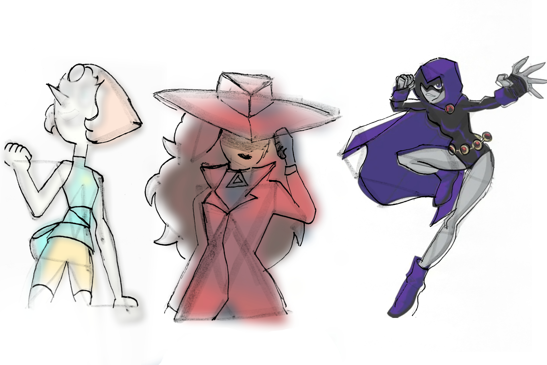
Normally, sharp character designs appear as villainous, but they can play alternative tropes. Triangles exaggerate size and can demonstrate fear, whether expressed through long, flowy capes and bony fingers or in mysterious, elegant silhouettes. However, the shape can appear neutral, like in the shape of hair.
“A lot of times in animation and art, you will want to quickly let an audience know what’s going on. Is this character a friend or a foe? So we look to shapes. Think of Maleficent from Sleeping Beauty and all her sharp triangular features and diagonal design choices. She’s most definitely dangerous,” Freelance Artist Mady Le said. (Wyatt Toth)

In addition to the shapes that construct a character, poses also use shape language. The shape of the pose can reflect the build in a character. Poses can exaggerate design, add visual appeal and convey emotion.
“Imagine two characters saying hi to you. One has a bombastic personality, and the other is more reserved and shy. Would it make sense for the one with the bombastic personality to be huddled over a bit, looking slightly away to not make direct eye contact, and have a small hand up that’s not moving,” Le said. (Wyatt Toth)
Corresponding with the composition that comes from shapes, the way an artist composes an image also suggests what the viewer should look at. Most images center around a focus, whether a product or a person. A picture should warp to direct the observer to the main focus of the overall image.
“Composition is all about directing the eye to elements you want your audience to notice. I try to use lines, shapes, and angles to point to the focal points of the piece. It’s almost like being on a rollercoaster; you want to ride around the piece, while staying within the picture by adding shapes that block the path of the eye from going off-canvas,” Animator and Illustrator Abby Goss said. (Wyatt Toth)

In tandem with shape language and color expression, silhouettes add life to a character. Top-heavy designs normally focus on wide shoulders to emphasize strength or pride, frequently seen in muscular characters. Short or stout designs add contrast to taller characters and appear soft or sensitive, think Mike and Sulley from Monsters Inc. Silhouettes can also depend on the clothing worn to distinguish characters of a similar build, which illustrators used frequently with fashion models.
(Wyatt Toth)
Before imageAfter image
Silhouettes hold importance as each character in a roster should stand out, which allows the viewer to identify a person from a crowd. Additionally, a unique visual aids in identifying a character in dark lighting or muddying circumstances. Characters need a silhouette that will stand out against a vibrant background.
“So have fun with your character designs. Big triangle torsos with small square heads, tiny square bodies with big circular heads. Mix it up and move away from making the same body types, not everyone’s gonna be a heart-shaped face anime girl with an hourglass body,” Le said.
(Wyatt Toth)
Warm colors stereotypically appear in sunrises and sunsets and in warm and cozy environments. Warm colors, typically orange and yellow, traditionally light up the piece as the stereotypical color of lightbulbs. Colors additionally add personality to a piece through the range of hues or tone variation.
“To add a little color variation, I’ll softly brush in a gradient of either a warmer or cooler tone to a main flat color. It helps to give it some more visual interest and texture, even in my usually flat cartoony style. I also like adding color to my lineart and just use the opportunity to add extra brightness and life,” Goss said.
(Wyatt Toth)
On the other hand, cooler colors frequent nighttime scenes and moody pieces. Normally, cooler colors, such as blue or violet, add shadows to objects. Artists prefer cool colors over black when shading, as it can lead a piece to look dull, flat and unnatural.
“If I use a warm yellow light for my scene, then I will naturally use a cool blue or purple as the shadow to balance it out. And vice versa. If it is meant to be a cold scene like in the Arctic, then I will just keep everything to the cool side,” Le said. (Wyatt Toth)

Outside of settings or lighting, color displays emotion. Red conveys love, power and anger, and blue can show sadness or serenity. Colors exhibit a plethora of meanings and contextualizations; additionally, colors show personal connotations.
“I work to use color unconventionally when it serves the story that I am trying to tell. For example, when I use ‘analogous’ color, which is colors close together on the color wheel, I usually want to have an ‘uncomfortable’ feeling in an image, as if something is about to happen. I believe that colors have ‘weight’ in an image, both physically and conceptually,” Pace said.
(Wyatt Toth)
When designing a character, multiple values come into play, drawings use multiple types of shapes, colors and silhouettes. Not all aspects of a character’s design reflect personality; opposite messages in design construct a complex character, whether through contrasting colors or shapes. Designing a complicated and successful character requires significant thought and effort.
(Wyatt Toth)

While NC lacks an art program specializing in character design, various principles still apply. Visual Arts Comprehension (VA Comp) teaches the basics of shading and elaborates on the uses of color. Other courses, such as Applied Design and Drawing and Painting, teach various media and techniques beneficial to character design.

Works Cited:
Character Design – Everything You Need to Know – NFI
Character Design: Key Principles for Stunning Visuals | Sky
10 Principles of Character Illustration – Yes, I’m a Designer
The Basics Of Character Design: Mastering The Fundamentals | CharacterHub
A BEGINNER’S GUIDE TO CHARACTER DESIGN
Principles of Character Design: Character Design Fundamentals Explained
VANAS | Character Design Principles


Donate to The Chant
$125
$500
Contributed
Our Goal

Your donation will support the student journalists of North Cobb High School. Your contribution will allow us to purchase equipment and cover our annual website hosting costs.

More to Discover
Donate to The Chant
$125
$500
Contributed
Our Goal